Data Collection and Representation
—
Data plays a vital role in the modern era of technology, research, and analytics. In mathematics, Data Collection and Representation focuses on gathering information through systematic methods and displaying it visually or numerically for better understanding and analysis.
—
What is Data Collection and Representation?
Data Collection involves gathering raw information from various sources, which can be qualitative or quantitative. Representation refers to organizing this data using tables, charts, and graphs to aid analysis.
Understanding how to efficiently collect and represent data is essential for solving real-life problems, making predictions, and drawing valid conclusions from a given data set.
—
Types of Data
Understanding the types of data is crucial before diving deeper into data interpretation techniques in math. Quantitative data is numerical and measurable. Qualitative data is descriptive and based on opinions or qualities.
Easy Questions
1. Identify whether the height of students is qualitative or quantitative.
**Answer**: Quantitative
2. Is the color of a car qualitative data?
**Answer**: Yes, it is qualitative.
Medium Questions
1. Classify the following as qualitative or quantitative: Age, Eye color, Test scores, Language spoken
**Answer**:
– Age: Quantitative
– Eye color: Qualitative
– Test scores: Quantitative
– Language spoken: Qualitative
2. Explain why temperature is considered quantitative data.
**Answer**: Because it involves numerical measurement and can be subjected to statistical operations.
Hard Questions
1. Given a mixed dataset: \{“Blue”, 30, “Tall”, 45.6\}, identify and sort qualitative and quantitative data.
**Answer**:
– Qualitative: “Blue”, “Tall”
– Quantitative: 30, 45.6
2. Explain with examples how some data can be both qualitative and quantitative depending on context.
**Answer**: “Ranking 1st place” implies order (qualitative – ordinal), but may carry numerical value (quantitative) such as points scored.
—
Methods of Data Collection
Methods include surveys, experiments, observational studies, and census. Choosing the correct method depends on the objective of the study.
Easy Questions
1. What method involves asking questions to a group?
**Answer**: Survey
2. Which method involves observing without controlling variables?
**Answer**: Observational Study
Medium Questions
1. Compare a sample survey and a census.
**Answer**: A census surveys the entire population; a sample survey selects a portion.
2. When is an experiment a better choice than observation?
**Answer**: When control over variables is required for accurate results.
Hard Questions
1. A medical study collects health data from 10,000 people. Is this a census or a sample? Justify.
**Answer**: Sample – unless the entire population is exactly 10,000, it’s not a full census.
2. Design a simple experimental method to check if a new teaching method improves math scores.
**Answer**: Use two groups: traditional teaching vs. new method. Evaluate average score difference using statistical tests.
—
Data Representation Techniques
Data is represented through tables, pie charts, bar graphs, line graphs, histograms, and frequency polygons.
Easy Questions
1. What kind of chart uses slices to represent parts of a whole?
**Answer**: Pie Chart
2. A bar graph represents which type of data – qualitative or quantitative?
**Answer**: Can represent both, but commonly qualitative.
Medium Questions
1. Draw a bar graph for data: Math – 20, Science – 25, English – 15
**Answer**: On graph paper, label subjects on x-axis and marks on y-axis. Draw bars up to corresponding values.
2. Which graph is better for showing change over time: bar or line graph? Why?
**Answer**: Line graph – it connects data points to show trends over time.
Hard Questions
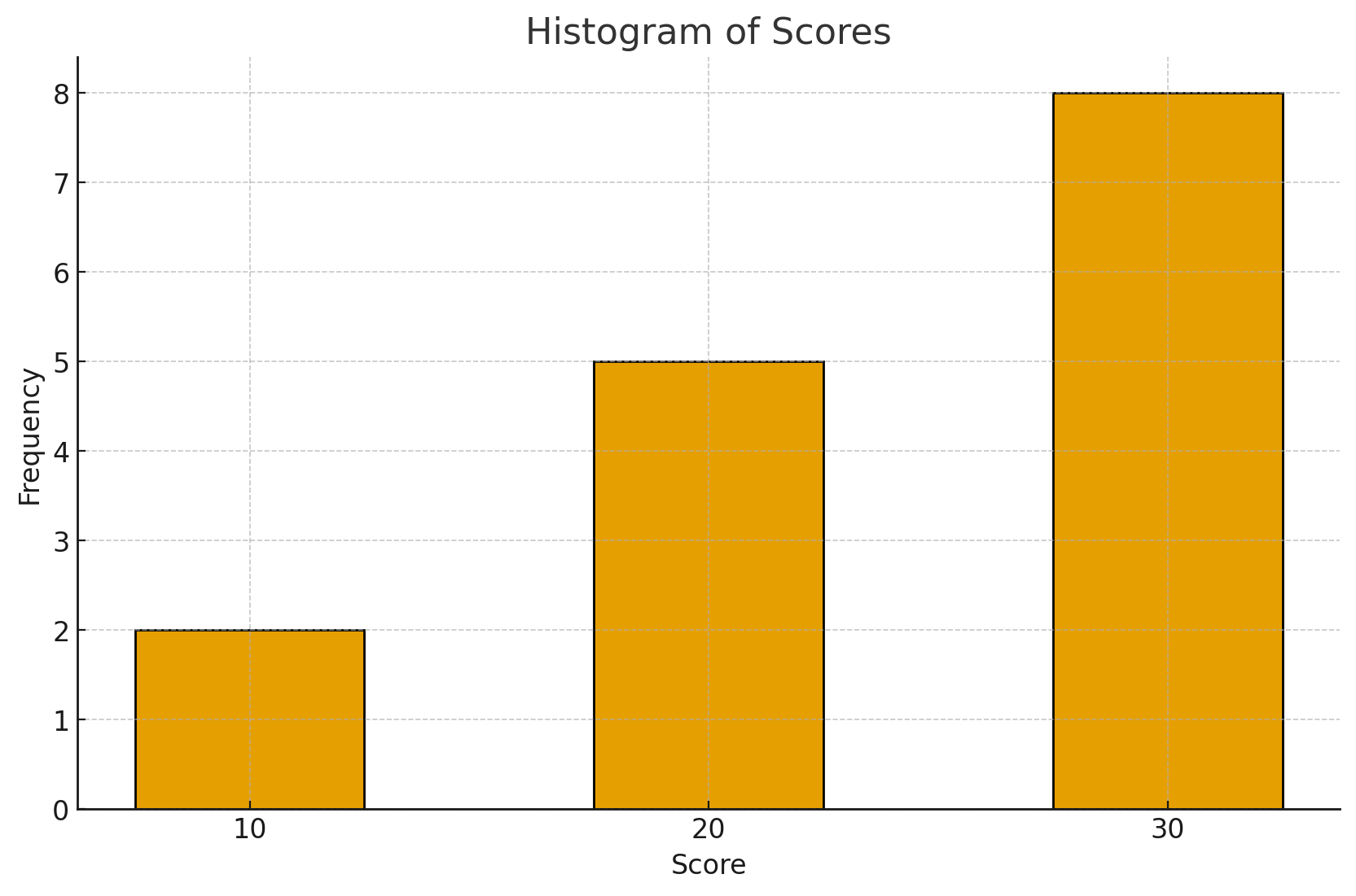
| Score | Frequency |
|---|---|
| 10 | 2 |
| 20 | 5 |
| 30 | 8 |
Plot a histogram.
**Answer**: Draw bars with scores on x-axis and frequency on y-axis. Each bar width represents the score intervals.
2. Explain when to use a histogram vs. frequency polygon.
**Answer**: Histogram for continuous grouped data; frequency polygon is useful to observe shape and trend of distribution.
—
Interpreting Data
This involves extracting meaningful insights by analyzing graphs, calculating mean, median, mode, and interpreting trends.
Easy Questions
1. What is the mean of 2, 4, 6?
**Answer**:
\[
\text{Mean} = \frac{2 + 4 + 6}{3} = \frac{12}{3} = 4
\]
2. Find the median: 5, 2, 9
**Answer**: Order: 2, 5, 9 → Median = 5
Medium Questions
1. Find mode in list: 3, 6, 6, 2, 9
**Answer**: Mode = 6
2. A line graph shows increasing temperature over days. What conclusion?
**Answer**: Temperature is rising over the period; possibly warmer weather trend.
Hard Questions
1. Given a data set: 12, 15, 13, 18, 21. Calculate Mean, Median, Mode.
**Answer**:
– Mean:
\[
\frac{12+15+13+18+21}{5} = \frac{79}{5} = 15.8
\]
– Median = 15
– No repeated values, so Mode = None
2. Interpret a histogram with two peaks.
**Answer**: Data may have two modes (bimodal distribution), indicating variations such as in age group preferences or product usage.
—
Importance of Studying Data Collection and Representation
Studying data collection and representation is critical for:
– Making informed decisions using data
– Understanding trends and predicting future outcomes
– Developing mathematical and analytical thinking
Mathematicians such as C.R. Rao and David Spiegelhalter have recently focused on the statistical aspects of data representation in education and public health. Their contributions show how good data interpretation leads to policy and scientific advancements.
—
Join Skorminda for Mastery
To fully benefit from this topic and more, students are encouraged to join Skorminda – a platform that provides structured classes, interactive exercises, and expert guidance to master Data Collection and Representation and other critical math concepts.
Master math with us, the smart way – only on Skorminda!
—
Let Numbers Speak!


No Comments